
Capital One
During my time at Captital One, I worked across several different products and services, from consumer facing brand comms, to ground up subbrading and UI design for new Capital One SaaS services.
The Exchange
Turns out a design system for a bank doesn’t translate to dev tools.
Capital One’s custom design system (called EASE) is mainly targeted for users doing basic banking and credit card tasks — things like checking balances, paying credit bills, and so on. That creates a design system that is fundamentally simple, and for a good reason.
The project I was working (called The Exchange) on was designated for users doing much more complicated tasks, for things in B2B experiences such as working with tables and many other complicated forms that require a level of sophistication that the main design system did not have. This is where a use case for a new design system came in to help standardize enterprise experiences across the company and create something that looks good, is usable, and doesn’t feel like your standard low effort “portal” experience.
With this design system created in Figma, based on the fundamentals of Capital One’s Brand, a new icon library, color palette, and components were introduced to create this improved experience. Equally accounting for the strict accessibility requirements that are baked into the system and needed for all large banks.


Due to the nature of this design work, I have a limited amount of UI available. Let’s chat about it.
The Exchange is an tool used by Capital One to build software tools, and other data heavy items for developers. Essentially a privately owned SaaS tool. This custom software experience turned lots of complex tools into a simplified way of working for developers.


Capital One -
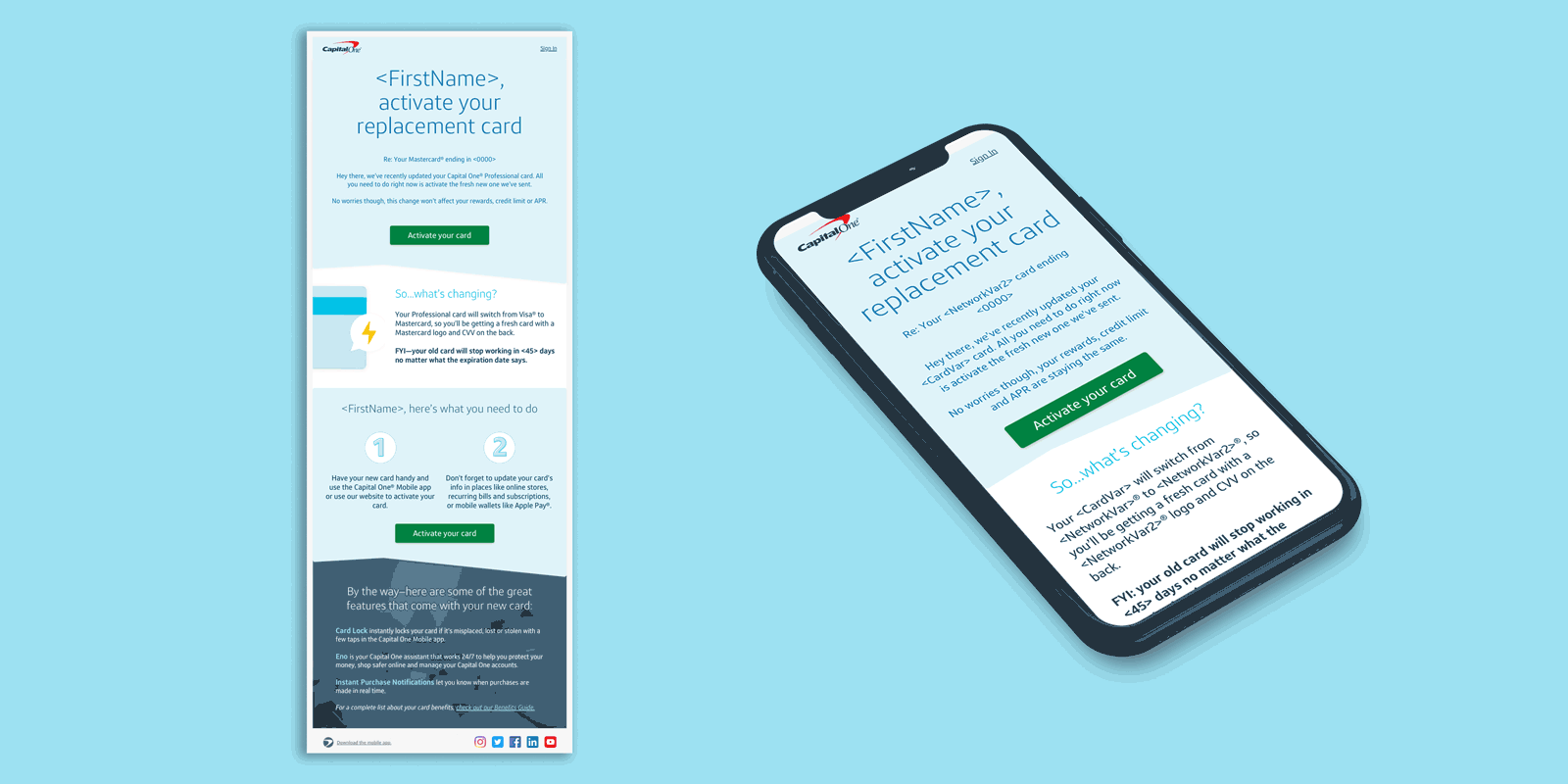
Upmarket


In this role I served as a designer and art director for a wide range of marketing comms, from email design, in store digital experiences relating to Savor, Venture, and Quicksilver credit cards. Here’s some stuff I had fun making.


Capital One Software - Slingshot
During my time tenure as a UI designer, I also help set the foundation of the SaaS warehouse management tool called Slingshot. I can’t show my work here, but you can check out the product in it’s current state here.